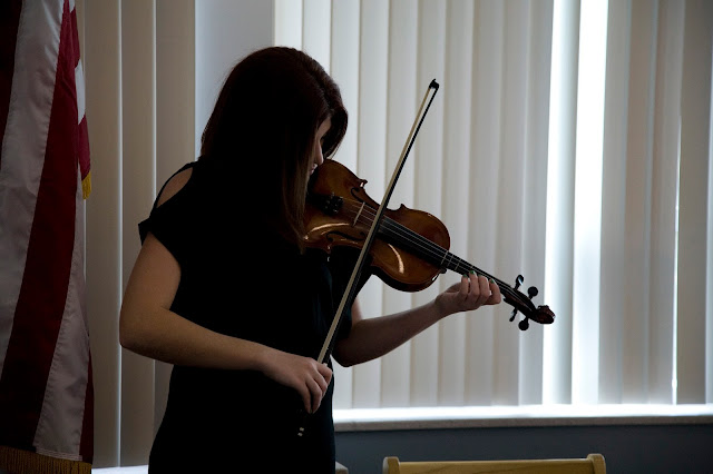
Woops - definitely did not realize that this needed to be a post. I decided to check out and critique William's portfolio, mostly because I knew that it would be stellar because he's such a talented photographer.
I love how simple the whole portfolio is, and I love the fact that he utilized as much space as possible. I love the fact that where there is not photographic material, there is a white background. I think this adds to the simplicity.
I also love the fact that he didn't overwhelm us with photos. He chose his very best, and to me, that is what makes his portfolio strong. Quality over quantity.
Great job, William!
And thanks to everyone for a great semester. :)
Nicole Winona's Photojournalism Blog
Thursday, April 28, 2016
Wednesday, April 20, 2016
Tuesday, April 19, 2016
Friday, April 15, 2016
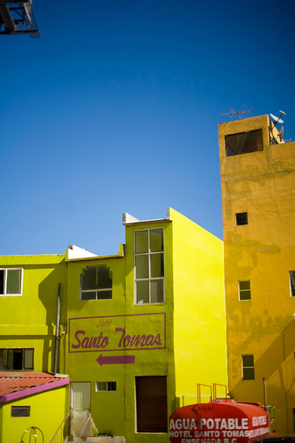
Feature News: Living Conditions of Downtown Ensenada, Mexico
I took my feature story photos a couple of weeks ago when I was in Mexico. This was the second time that I've been there, and I thought that it would make for a visually appealing story.
Each time that I visit Mexico, I realize that I'm lucky to have the life that I have, and I think that some of these photos do a good job of conveying why.

Tuesday, April 5, 2016
Illustrative Photojournalism: Light Pollution
 | |
| Photo by Nicole Winona |
14mm 2.8, 30 seconds, ISO 500
 |
| Photo by Nicole Winona |
14mm 2.8, 30 seconds, ISO 500
*disclaimer: I'm turning in the above two photos as my assignment, and am using the photos below ONLY as supplementary material to back up my take on the issue.
What is light pollution?
Well, Google tells us that light pollution is a "brightening of the night sky caused by street lights and other man-made sources, which has a disruptive effect on natural cycles and inhibits the observation of stars and planets." and I'd say that's a pretty solid definition.
Why do I care?
Multiple reasons.
One reason is that, because of light pollution I have to travel far away from town to get photos like this.
 |
| Photo by Nicole Winona |
So, what can we do about it?
Well, in our class discussion, our teacher told us that cities can enforce lighting ordinances to help with the problem. Toquerville is an example of a city where an ordinance such as this has been proposed. Basically, lighting ordinances require outdoor lighting to be "night sky friendly" thus eliminating glare, light trespass and skyglow. (Which can be seen in the images at the top of this post. Primarily in the second photo.)
My Take:
I took the top two photos just outside of town past the Chuckwalla trail head. I thought this would be the perfect place to display how light pollution effects the sky, because it's close enough to town for the haze of the city lights to be seen, yet far enough away that the stars are somewhat visible. I think that the second image illustrates best, what I was trying to achieve because of the extreme gradient created by the lights. For that shot, I pointed my camera to the south, toward town so that I was directly shooting into the pollution, whereas the first photo was shot facing north, away from the pollution.
I thought this was an interesting topic, because before we talked about it in my class, this was something that I hadn't really considered as a problem that could be resolved. I can see how it would become somewhat of a controversial issue, mostly because I think that home and business owners would view it as a hassle, and an unwanted expense to change exterior lighting, but I definitely see the benefits of it. We're really spoiled here in Southern Utah, because although we clearly have some light pollution, we have much less than most other places. Dark Sky Finder shows that un-polluted skies can be found as close as 30 minutes away.
My teacher, Alex Chamberlain, made an interesting comment about light pollution while we were in our discussion. He explained that air pollution, water pollution, litter, and other types of damage that we as humans inflict on the earth take years to undo, and in some cases cannot be undone at all. Light pollution is the exception to this. It can literally be undone with the flip of a switch. It's interesting to think of the below picture as an every night possibility.
 |
| Photo by Nicole Winona |
Wednesday, March 23, 2016
Hard/Spot News: Southern Utah Performing Arts Festival
I decided to shoot Southern Utah's Performing Arts Festival for my hard news assignment. While shooting this assignment, I couldn't help but notice how similar this type of photography was to shooting a wedding reception. I strapped on my telephoto lens, and tried to sit back in the crowd and document what I saw without being noticed, much like I would at a wedding reception. But I guess if you think about it, shooting an event like a wedding reception can sort of be considered photo-journalistic.
As someone who used to perform in SUPAF, I kind of had the competitive advantage while shooting, because I knew what to look for, and I knew what would make interesting shots. I also had a background understanding of what the event was, so I didn't have to ask, or figure it out on my own.
I think that the main difficulty of shooting this even was that it was the fact that the visual scenes that occur are so repetitive. Something else is that I was definitely a little bit self conscious about how loud my shutter was... and I couldn't figure out how to make it less noisy. Woops!
All in all, I'd say that I got a somewhat successful take, given that it was so dark, and that my telephoto lens isn't super great.

Sunday, March 20, 2016
Portraiture Part II
I used a south facing window for these portraits of my dad. I went into these with the thought that, because the southern light would be more harsh, I might be able to get a harsher triangle. I'm actually not sure that I accomplished that, because I would consider this more of a split lighting scheme, but it was still really fun to play with.
I took this portrait on Friday, around 3:00p.m. on top of Angels Landing. This one really doesn't have anything to do with the lighting schemes that we went over in class, but I thought that it was a good example of how to expose using the sun as a back light.
I went into this portrait session thinking that I would use the diffused sunlight to create something similar to glamour lighting. I shot these over the weekend at sunset, and there were a few clouds in the sky breaking up the lighting. I'm really happy with how these turned out, and I think that out of all of my experimental shots, these turned out the best.
The next few shots consist of a mixture of different lighting techniques. My sister came on a shoot with me, and as we waited for my client to show up, we shot a few. The first few were shot in the shade, and are more evenly lit, and I used harsher, more direct light for the last few to create Rembrandt, and attempted to create glamour lighting.
Rembrandt
Rembrandt
Attempted glamour - turns out that high sun doesn't really work for glamour lighting... haha
Subscribe to:
Comments (Atom)


